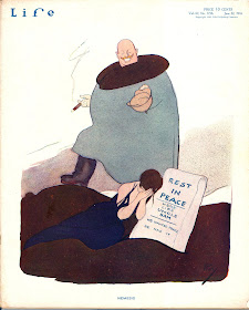
The obituaries published in both the New York and Los Angeles
Times upon Rea Irvin's death in 1972, at the age of 90, give the impression that he did little else but create
this doofus for the cover of the first issue of the
New Yorker and hang out at the
Players and the
Dutch Treat Club. Irvin's place in literary history as the first art director— the first employee, in fact— of
The New Yorker is appropriately noted but there's no mention made of the typeface and the design he created for the magazine, which has remained practically unchanged for 83 years. (For that see this
article from
Print.) It's all about the fop, which is a nice enough drawing and, god knows, plenty iconic. It's probably the most well-known magazine cover ever. It also has the distinction of being among the rarest of illustration jobs, one that paid a lifetime annuity¹. But it is far from the only
New Yorker cover he did, and there is a tremendous body of Irvin's work from nearly two decades preceding the birth of
the New Yorker that also goes unremarked upon. The obituaries barely hint at what the
World Encyclopedia of Cartoons described as "Irvin's enormous impact on American cartooning."
His simplified, posterlike drawings were almost revolutionary and inspired a generation of imitators. His composition was flawlessly attractive, and his figures, for all their animation and exaggeration, were anatomically sound. ...He drew many series of full-pagers for Life, illustrated many books, created the cover design for the New Yorker, and helped shape the magazine's formidable approach to cartooning, certainly one of the major forces in American graphic arts.
Rea Irvin was born in San Francisco in 1881, and studied there at what was then the
Hopkins Art Institute. He worked at several newspapers in San Francisco and in Honolulu before briefly pursuing a career as an actor in 1903. Shortly thereafter he arrived in New York , an illustrator once again.
 |
| January 2, 1908. |
The drawings posted here are from the beginning of Rea Irvin's association with
Life, up until the arbitrarily chosen stopping point of 1914. According to a
short biographical sketch published in the December 14, 1911 issue, it took Irvin five years to find his way to
Life's offices. That would make the spinster cartoon at the right one of the earliest, if not the very first, drawings he did for
Life.
Brendan Gill wrote in his obituary for Irvin in the
New Yorker, "His style as an artist was decorative and was deliberately without depth of perspective; it had the quality of Chinese calligraphy, though with a Western boldness of color. He had the patience of a skilled craftsman and could draw in almost any mode." Ironically, for an artist who would essentially be remembered for a single drawing, no one at
Life was more untethered to a single style than Irvin, including his contemporary and fellow Westerner
Fred Cooper. There may be a typical Irvin drawing style from which everything else he did departs, but what is consistent throughout his work is perfect composition, amazing color sense (this will be more apparent in future posts) and wit.

December 8, 1910.
December 15, 1910.
September 7, 1911.
December 14, 1911.
September 12, 1912.
January 23, 1913.
March 27, 1913.
March 27, 1913.
April 24, 1913.
October 23, 1913.
January 29, 1914.
May 21, 1914.
May 28, 1914. July 9, 1914.
 July 30, 1914.
September 10, 1914
October 1, 1914.
October 8, 1914.
October 29, 1914.Letters of a Japanese Schoolboy
In 1913 Irvin illustrated the "Letters of a Japanese Schoolboy" for
Life. The feature, created by the humorist
Wallace Irwin, originally ran in
Colliers in 1907 and later appeared in newspapers and
books. It purported to be a collection of observations on American life by a visiting Japanese "boy," the 35-year-old
Hashimuro Togo and written in an unlikely pidgin dialect.
It's the illustrations that matter here, anyway. This assignment provided Irvin with opportunity to play with the style and design of Japanese prints and brushwork and to mimic in pen and ink the effects of
ukiyo-e wood block printing while remaining modern and American. Irvin did two drawings for each installment; the first pair of drawings below couldn't offer a better example of his versatility.
October 23, 1913.February 5, 1914.April 23, 1914.August 6, 1914.August 13, 1914.September 24, 1914.October 8, 1914..
.


